Colors
I received an email from my friend, and I got permission to share it in part. And I think there’s a good illustration here.
… I’ve been waiting to thank you, and I’m really hoping it’s a repeat, but I’m not sure I ever fully expressed what a gift your color lesson was for me and continues to be.
Awhile ago you told me to notice the different yellows on Amica. I’ve been reflecting on this as I’ve had an abundance of quiet time this week. And I’m hoping to start painting soon.
The Amica lesson was more than noticing the different shades though – it was a reminder to look deeper, to look beyond … to where God stretches us. Life’s not black and white. Life’s perspectives are like the colors, there are many!
I went for a walk yesterday (slower than normal) hoping the cooler air would feel better on my lungs, and I found myself in awe of all the different greens in the trees. There was your life lesson unfolding again! …
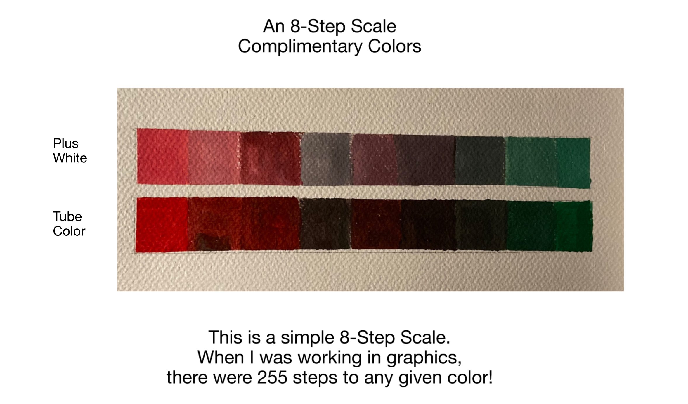
Yes there are so many colors, so many levels. I have been toning down out-of-the-tube colors by adding a tingle of its opposite trying hard not to use black or white or just a speck if I needed. By adding a tingle of its opposite alone gave me a richer tone. (If you keep adding it will take you all the way to the other color – see above.) And its amazing the range, number of levels possible depending on the reds, blues or yellows used to make up the complimentary. It’s infinite really.
And that got me thinking about how it relates to scripture – Ephesians 3:17 in particular – where it says about the breadth, the height, length and the depth of God’s love.
Mixing right on my palette, there are so many possibilities, beyond understanding, beyond knowledge but there’s a knowing to the fullness and richness of them. Much like the God’s love for us that is beyond knowledge, but is a knowing that we are filled with the fullness of it.
So if you’re curious, try your own mixing. Use pencil crayons, pastels, even crayon. Mix opposites in small steps, then a speck of black or white and see what happens. Or if you’re more adventurous get some cheap acrylics. All you need are the primary colors pus a bit of black and white. Then let your palette do the talking. Note: Be aware that the cheaper the paint, the more filler there is wearing down the true pigment. Much like the ingredients on a food label! But even the cheapest have something to offer. Then notice the range. Its really quite remarkable.
So go ahead prime the pump of your own vision. Be prepared to look for and see new vistas.